The 30-Minute Map That Saved a Project
How a short coaching session revealed hidden dependencies and prevented the automation of a broken process.
Commentary Details
Sometimes, the most valuable thing you can do is stop a project before it starts.
We often glorify the "bias for action"—start building, start coding, start shipping. But what if you're building the wrong thing? What if your automation project is about to cement a broken process into code?
A recent coaching session reminded me just how powerful a simple map can be. In just 30 minutes, we went from "ready to automate" to "project halted"—and that was a massive win.
The Context: "We Need to Automate This"
The situation was classic. A team had a manual process involving form filling. It was tedious, slow, and prone to error. Naturally, the solution seemed obvious: Automation.
The idea sounded great. Why wouldn't you want to automate tedious work?
If we had stayed in the world of text and verbal explanations, the project would have kicked off.
But instead, we drew a map.
The Map: Visualizing the Invisible
By mapping the landscape, we made the invisible visible. Here is what we found:
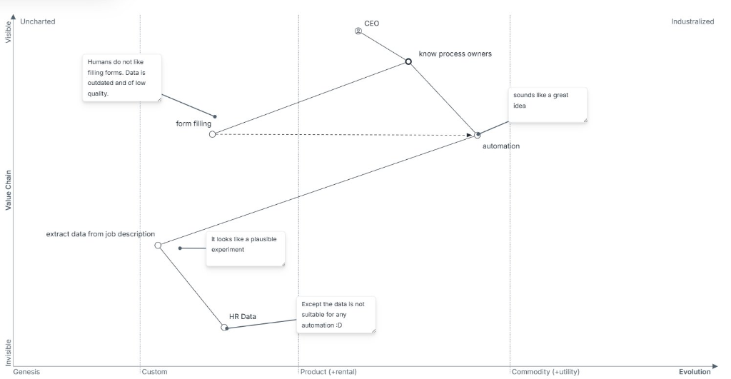
The map revealed a critical chain of dependencies:
- Automation takes Form Filling to the next level.
- Automation depends on Data.
- And here is the kicker: The Data placed in another department was in equally sorry state.
Why? Because "Humans do not like filling forms."
The Insight
The moment we put this on a map, the flaw became obvious.
The goal was to automate the form filling to save time. But the input for that automation was data that was already garbage because the manual process was broken in some other place. Automating it wouldn't fix the data quality issues; it would just waste time to reveal the problem elsewhere.
As the note on the map says: "Except the data is not suitable for any automation :D"
The Result: Avoiding Failure
The outcome of that 30-minute session wasn't a finished product. It was a decision to not build.
"30 mins coaching session that saved weeks of work and probably an end year bonus. Definitely avoided unnecessary project failure."
Instead of wasting weeks building an automation tool that would inevitably fail due to bad data, the team could pivot. They could focus on the real constraint: the data quality and the user experience of providing that data (making the data "visible" and "high quality" first).
Conclusion
This is the power of Wardley Mapping. It’s not about drawing pretty pictures; it’s about alignment and shared understanding.
In the daily grind, it's easy to get tunnel vision. "My job is to automate X." But a map forces you to look up and ask, "What does X depend on? And is that foundation solid?"
A map allows you to challenge assumptions without attacking people. You aren't saying "your idea is bad"; you're pointing to a line on a page and asking, "Is this relationship true?"
In this case, that simple question saved weeks of work. What could a 30-minute map save you?
Tags
Explore More Resources
Continue your strategic thinking journey with our guides, case studies, and tools