
Where do you position the customer requirements on the evolution axis?
At the moment I am using Wardley maps to think about business units / lines of business rather than whole companies. In this context, I haven’t seen any rules for where to position the customer requirements on the evolution / maturity scale, and thought that some guidelines might be helpful.
In the 1990s, noted Japanese quality guru Noriako Kano suggested that customer requirements could be considered to fall into three groups, depending on the relationship between how well the quality attribute is realised and how the customer feels about the outcome.
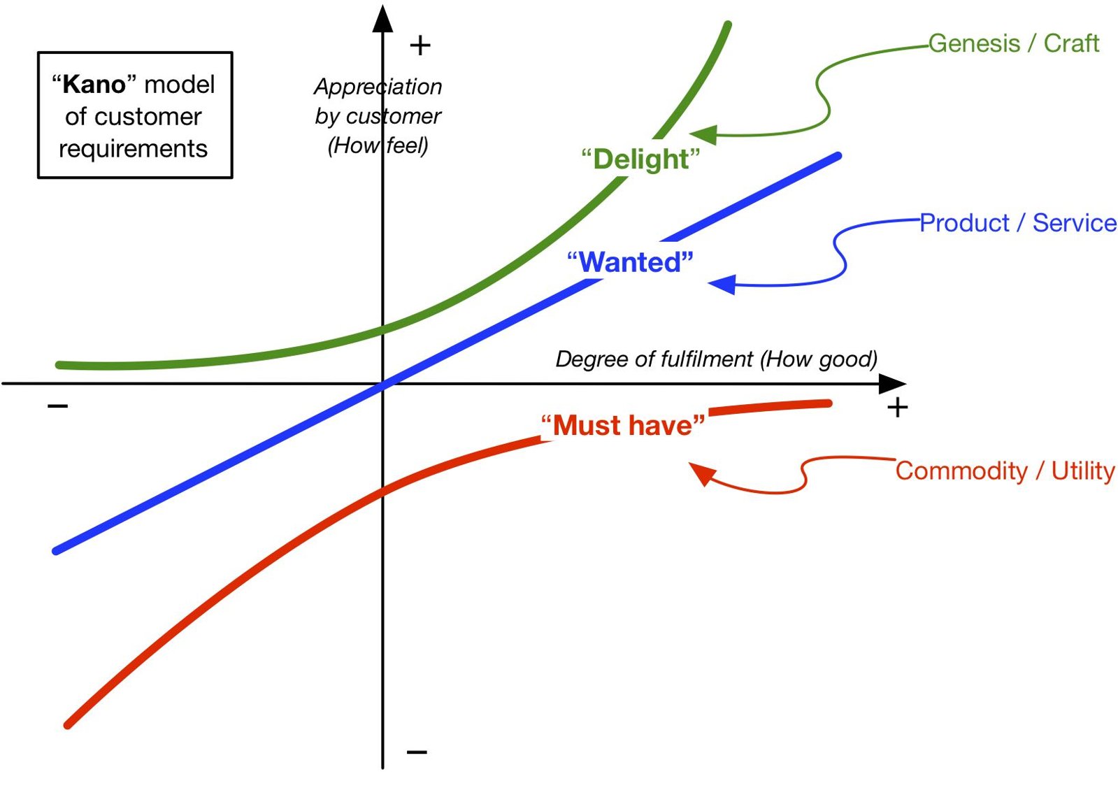
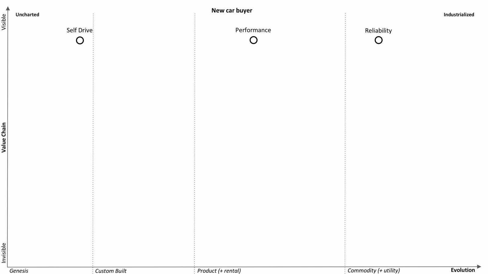
- “Must have” requirements don’t excite the customer when done well, but can cause dissatisfaction if done poorly – think reliability for a car.
- “Wanted” requirements roughly scale – the better done, the happier the customer – think performance or fuel economy for a car.
- “Delight” requirements can make the customer happy by virtue of existing at all – think self-drive for a car.
Intuitively, it would appear that these categories correspond broadly to the maturity of the product delivering the requirement.
- “Must have” is a characteristic of a commodity or utility
- “Wanted” is a characteristic of a product / service
- “Delight” is a characteristic of a genesis or custom-built offering.
As with economic evolution of technology, yesterday’s “delight” is today’s “wanted” and tomorrow’s “must have”.
So, when thinking about the customer requirement, consider whether it is “must have”, “wanted”, or “delight” and position accordingly from left to right on the evolution spectrum!
Robert Lamb
[email protected]